In the last couple weeks, some very welcome updates came to the Azure portal. There’s lots of little changes to the verbiage throughout, such as updating the “Browse” button to “More Services” – I bet the documentation team is going to be updating that for quite some time now. Two of the changes have really stood out for me:
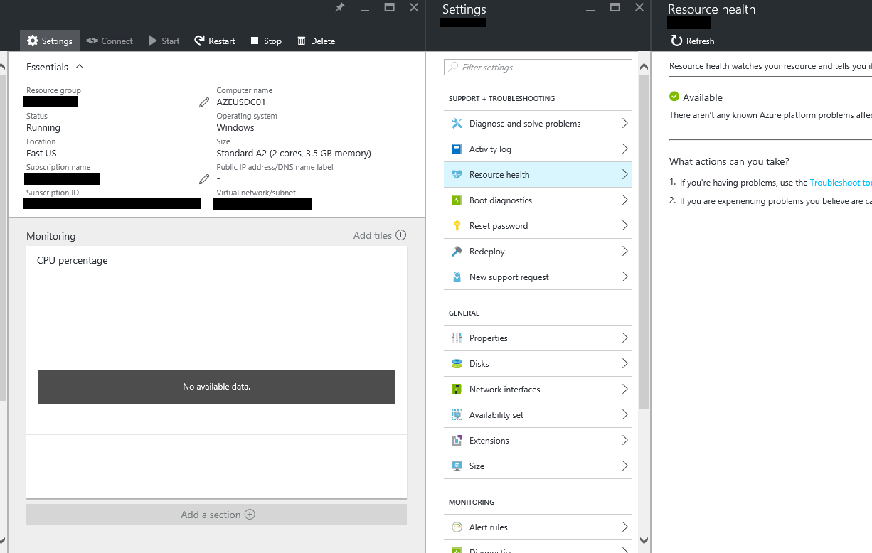
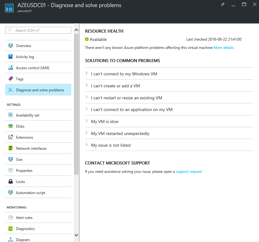
When you navigate to a resource, you see a list of settings and properties on the LEFT side of the screen, and the RIGHT side of the screen simply updates with the new content – this is a good change, because previously, every time you change context, the screen would redraw. For example, clicking on Overview from the current view would scroll to the left, and then to the right as the screen moves. This wasn’t particularly reliable either. The new method is much easier to manage.

The old way – you can still find this if you look for it, under the Settings button on some resources
The other change that stands out is the new Resource Cost section, which can help administrators quickly determine how much a resource or group of resources is costing them or their organization. This is a huge help for those who need to have more granular cost control.
The Azure Billing team now has a Twitter account: @azurebilling. Despite the egg avatar, it’s real. They mention another useful update, which is the ability to view bills directly in portal.azure.com without needing to be the Account Administrator. This has been a real pain point for many customers so it’s nice to see it now:
Now better cost analysis in Azure. View costs by tag or resource group. Subscription->Settings->Resource costs. pic.twitter.com/OGaQqGkhGp
— Azure Billing (@AzureBilling) August 18, 2016
Of course, there’s a some variance in how different organizations get their Azure bill, so some of these features may not be quite ready for your subscription yet.


